Shop the Look
Create shoppable lifestyle images with interactive hotspots. Let customers click directly on products within styled photos to discover and purchase items instantly.
Overview
Shop the Look transforms static lifestyle imagery into interactive shopping experiences. Perfect for fashion, home decor, and any brand that benefits from contextual product presentation.
📍
Interactive Hotspots
Click-to-reveal product details on any image
🛍️
Quick Shop
Add to cart without leaving the image
🖼️
Multiple Looks
Display up to 4 shoppable images in a slider
📱
Mobile Optimized
Touch-friendly hotspots and product panels
When to Use
- Outfit inspiration — Show complete outfits with clickable product hotspots
- Room styling — Let customers shop individual pieces from styled room photos
- Collection showcases — Feature multiple products in a single lifestyle context
- Lookbooks — Create interactive editorial content
How It Works
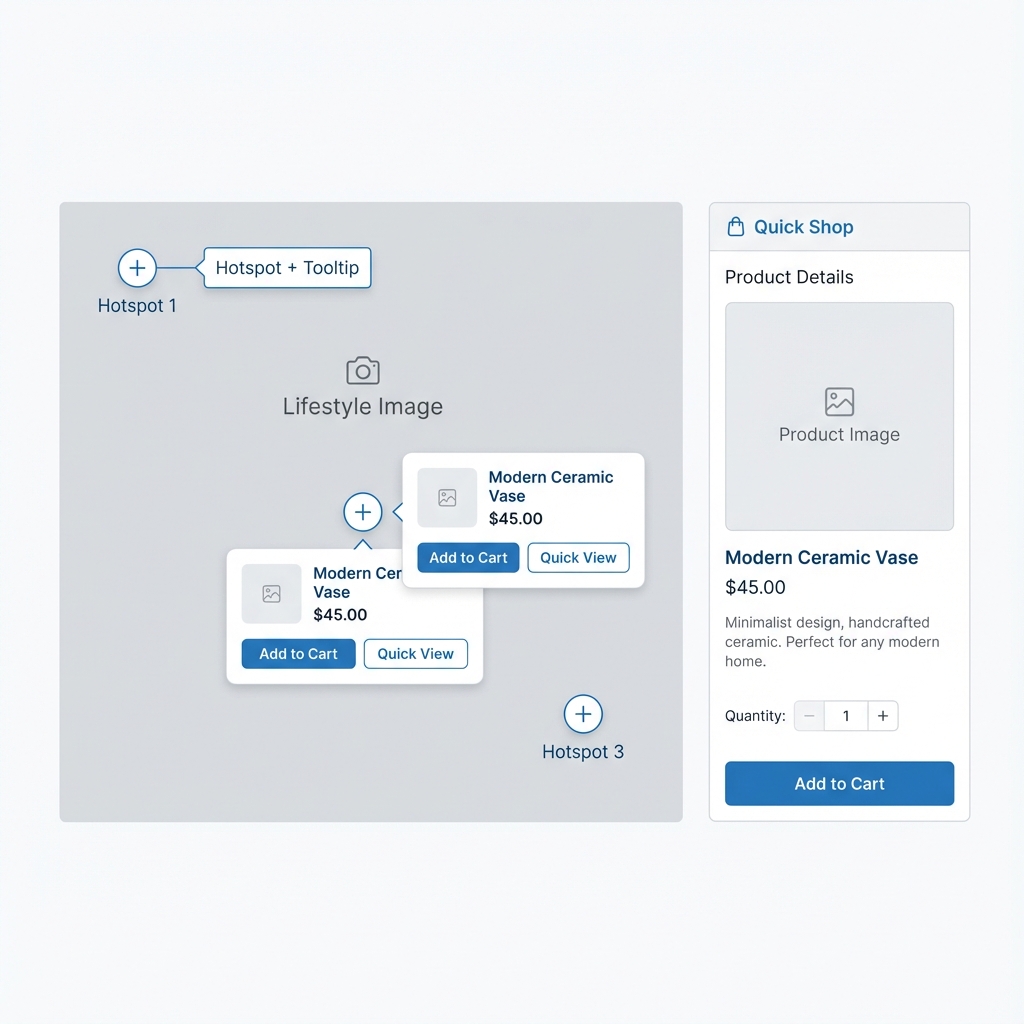
Hotspots on lifestyle images expand to show product details and quick-add options
Quick Setup
Create a Shoppable Image in 4 Steps
- 1In the Theme Editor, click Add section → Shop the look
- 2Click the Look block and upload your lifestyle image
- 3Select up to 4 products and position their hotspots using the percentage sliders
- 4Adjust the hotspot style to match your image (light or dark)
Section Settings
Content
| Setting | Type | Default | Description |
|---|---|---|---|
| Heading | text | Shop the look | The section title displayed above the look. |
| Description | richtext | - | Optional text displayed below the heading. |
Behavior
| Setting | Type | Default | Description |
|---|---|---|---|
| Open first product on desktop | checkbox | true | Automatically show the first product's details when the section loads on desktop screens. |
| Card image effect | select | None | Animation effect for product card images. Options: None, Reveal, Zoom. |
| Card image position | select | Top center | How product images are cropped within cards. Options: Top, Center, Top center. |
Appearance
| Setting | Type | Default | Description |
|---|---|---|---|
| Controls style | select | Dark | 'Light' uses white hotspots for dark images. 'Dark' uses dark hotspots for light images. |
| Image overlay color | color | #000000 | Color of the optional overlay on the lifestyle image. |
| Image overlay opacity | range | 0 | Intensity of the overlay. 0 = no overlay, 1 = fully opaque. |
Layout
| Setting | Type | Default | Description |
|---|---|---|---|
| Width | select | Page width | Section width. Options: Page width, Narrow, Wide. |
Spacing
| Setting | Type | Default | Description |
|---|---|---|---|
| Desktop top | range | 0px | Top margin on desktop screens. |
| Desktop bottom | range | 0px | Bottom margin on desktop screens. |
| Mobile top | range | 0px | Top margin on mobile screens. |
| Mobile bottom | range | 0px | Bottom margin on mobile screens. |
| Include top padding | checkbox | false | Add inner padding at the top of the section. |
Block Types
Look Block
Each Look block represents a single shoppable image with up to 4 product hotspots.
Images
| Setting | Type | Default | Description |
|---|---|---|---|
| Desktop | image | - | The main lifestyle image. Recommended size: 2000×1400px or similar landscape ratio. |
| Mobile | image | - | Optional portrait image for mobile. Falls back to desktop image if not set. |
Product Hotspots (1-4)
Each product has these positioning settings:
| Setting | Type | Default | Description |
|---|---|---|---|
| Product | product | - | Select the product to feature in this hotspot. |
| Top % (desktop) | range | 50% | Vertical position of the hotspot on desktop. 0% = top, 100% = bottom. |
| Left % (desktop) | range | 50% | Horizontal position of the hotspot on desktop. 0% = left edge, 100% = right edge. |
| Top % (mobile) | range | 50% | Vertical position of the hotspot on mobile. |
| Left % (mobile) | range | 50% | Horizontal position of the hotspot on mobile. |
💡 Tip: Position hotspots separately for desktop and mobile because your images may be cropped differently on each device.
Best Practices
Photography Tips
- Keep products clearly visible — Ensure each featured product is easily identifiable in the image
- Leave hotspot space — Don't crowd products together; give each hotspot room to breathe
- Use consistent lighting — Match the lifestyle photo's lighting with product images for a cohesive look
- Consider mobile cropping — Upload a separate mobile image if products might be cropped out
Hotspot Positioning
Top-left corner
Top: 10-20% | Left: 10-20%
Top-right corner
Top: 10-20% | Left: 80-90%
Center
Top: 45-55% | Left: 45-55%
Bottom-left
Top: 75-85% | Left: 10-20%
Bottom-right
Top: 75-85% | Left: 80-90%
Recommended Product Count
- 2-3 products — Ideal for most looks, keeps the image clean
- 4 products — Use for complex outfits or room scenes
- 1 product — Consider using Hero Banner instead for single product features
How It Works
Desktop Experience
- The lifestyle image displays with circular hotspot indicators
- First product opens automatically (if enabled)
- Clicking a hotspot reveals the product card in the side panel
- Thumbnail strip allows quick switching between products
Mobile Experience
- Image displays full-width
- Hotspots appear at mobile-specific positions
- Tapping a hotspot shows the product card below the image
- Thumbnails provide alternative navigation
Troubleshooting
Hotspots not visible
- Check Controls style setting — use Dark for light images, Light for dark images
- Ensure products are selected for each hotspot slot
- Verify your image isn't covering the hotspots with similar colors
Products not showing when clicked
- Ensure products are published and available
- Check that product images exist (required for thumbnails)
- Try refreshing the Theme Editor
Hotspots in wrong position on mobile
- Set separate Top % (mobile) and Left % (mobile) values
- Upload a dedicated mobile image if the crop is significantly different
- Test in preview mode on actual mobile devices