Section reference

Product Grid

Use the standard collection product grid when your store needs fast browsing, filters, sorting, product cards, swatches, and quick add in a predictable layout.

File: sections/collection-product-grid.liquidSetup: 10 minutesBest for catalog browsing

SAISON collection templates often use Image text grid for editorial layouts. Use Product Grid when you need a simpler catalog page where product discovery matters more than campaign storytelling.

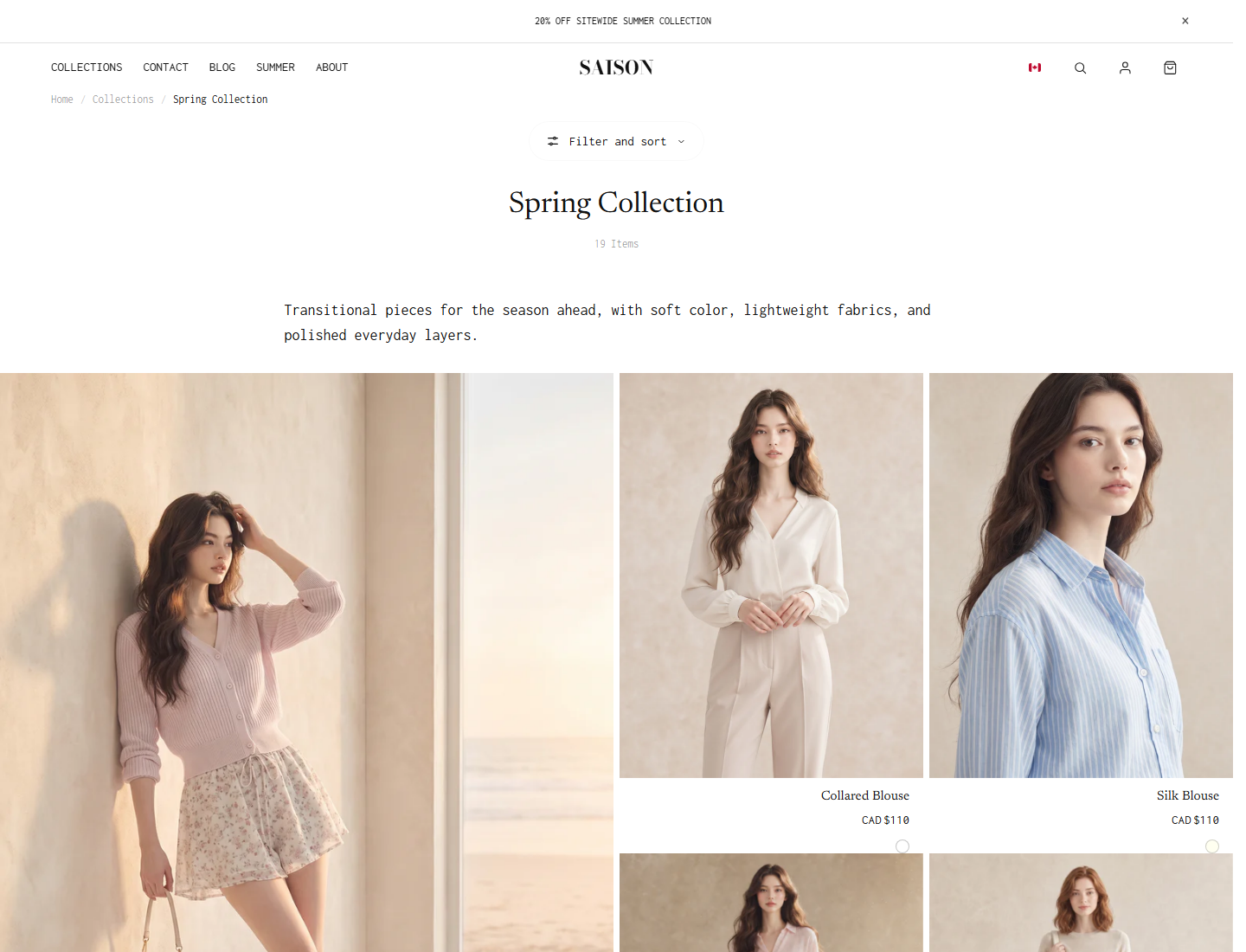
SAISON collection product grid with filter and sort controls
Standard collection grid: use this when shoppers need filtering, sorting, and quick comparison.
  • Use 4 columns for most desktop catalogs.
  • Use 3 columns when imagery or product names need more room.
  • Check mobile product cards after changing image ratio or quick add.
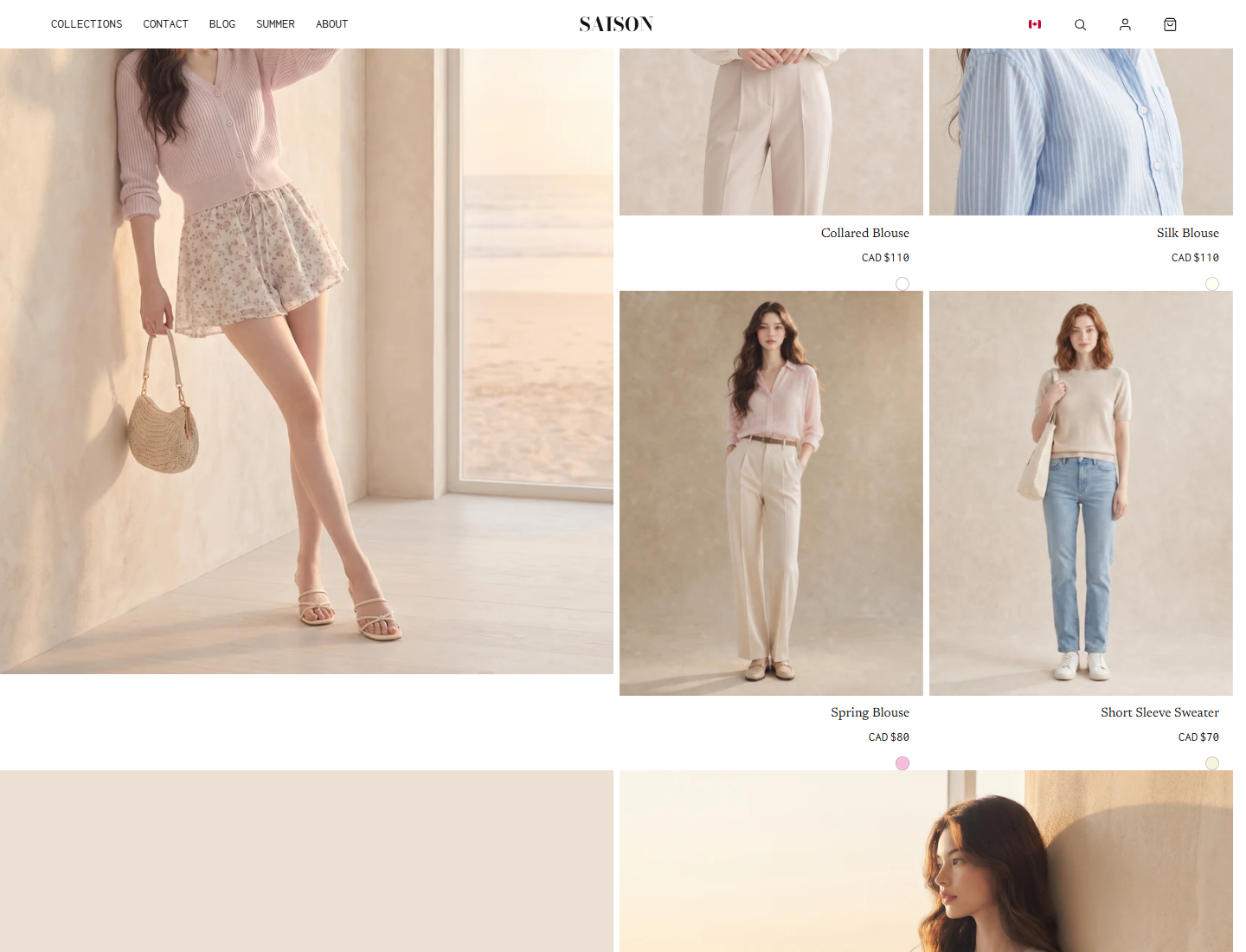
SAISON collection grid with a larger editorial tile beside product cards
If the page needs larger editorial moments, compare this section with Image text grid before building the collection.
  • Use Image text grid for hero products, look tiles, promo tiles, and repeat rules.
  • Use Product Grid for straightforward browsing and filtering.
  • Keep large editorial tiles sparse on collection pages.

Build It In Shopify

1

Confirm filters and product data

Use Shopify Search & Discovery to create filters. Confirm products have consistent tags, options, prices, images, and availability.

2

Set grid density

Choose desktop and mobile column counts based on product image detail, title length, and how quickly customers should compare products.

3

Tune product cards

Configure image ratio, hover media, badges, sale price display, swatches, and quick add so cards behave consistently across collections.

4

Test shopping states

Test filtering, sorting, pagination or load more, quick add, sold-out products, swatches, and mobile layout.

Theme editor setting

Columns

What this controls

Controls how dense the product grid feels.

When to change it

Products feel cramped, oversized, or hard to compare.

Watch out

Using dense grids with long product names or detailed imagery.

Theme editor setting

Filters and sorting

What this controls

Lets customers narrow a collection.

When to change it

The catalog has enough products or attributes to need filtering.

Watch out

Adding filters that most products do not populate.

Theme editor setting

Product card image ratio

What this controls

Controls the crop rhythm of cards.

When to change it

Cards look uneven or product subjects are cropped.

Watch out

Fixing inconsistent source images only with theme settings.

Theme editor setting

Quick add

What this controls

Lets customers add from the grid.

When to change it

Merchants want faster shopping from collection pages.

Watch out

Direct add for products that require choices.

Theme editor setting

Swatches

What this controls

Shows color or material options on product cards.

When to change it

Customers compare variants before opening product pages.

Watch out

Expecting swatches to work with inconsistent product option data.

Common mistakes

  • Using Product Grid for a campaign page that really needs Image text grid.
  • Changing grid columns before product image ratios are consistent.
  • Enabling filters before product data supports those filters.
  • Using direct quick add on variant-heavy products.
  • Testing only desktop and missing cramped mobile product cards.