Summer campaign page
Build a seasonal or launch campaign page using SAISON's original campaign sections, including mosaic grids, reveal video, sticky scroll, filmstrip carousel, and distorted reveal slider.
The Summer campaign page is a model for any visual campaign. Use it when you want more than a collection page: a page with story, movement, product direction, and a strong seasonal mood.
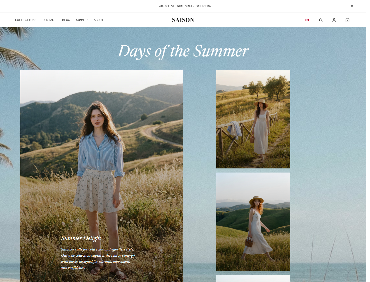
- Use the opening section to communicate the campaign mood immediately.
- Prepare dedicated mobile crops before tuning spacing.
- Add a product or collection path before the page becomes heavily editorial.
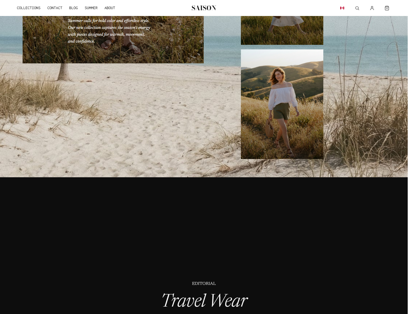
- Use only one or two heavy motion sections on a campaign page.
- Keep sticky and reveal copy short.
- End with a clear shop, collection, newsletter, or campaign action.
Recommended Page Flow
- Open with one campaign hero or visual statement.
- Use a mosaic or image-led section to establish the season.
- Add a product or collection path before the page becomes too editorial.
- Use one motion-heavy section such as sticky scroll or distorted reveal.
- End with a clear shop, collection, or newsletter action.
Setup Steps
Choose the campaign objective
Decide whether the page should sell a collection, introduce a drop, promote a sale, tell a seasonal story, or support a larger homepage campaign.
Collect the media set first
Campaign sections depend on strong imagery. Prepare hero images, mobile crops, video poster images, product images, and any filmstrip images before building.
Build the first half of the page
Add the hero, mosaic grid, and first product or collection link. Confirm the page is shoppable before adding advanced effects.
Add one advanced effect
Choose sticky scroll, reveal video, filmstrip carousel, or distorted reveal slider. Avoid stacking several heavy effects in a row.
Close with conversion
End with collection links, featured products, a newsletter capture, or a campaign callout. Do not end on a purely decorative section.
Key Settings
| Setting | Location | Recommended | Notes |
|---|---|---|---|
| Mobile media | Every image-led campaign section | Use dedicated mobile crops | Campaign imagery often fails on mobile if only desktop crops are used. |
| Autoplay video | Reveal video | Use only with muted video and poster fallback | Keep performance and mobile behavior in mind. |
| Sticky height | Sticky scroll | Long enough to read, short enough to browse | Too much scroll distance makes the page feel slow. |
| Filmstrip speed | Filmstrip carousel | Slow or user-controlled | Fast motion can make product imagery hard to inspect. |
| Reveal slide text | Distorted reveal slider slide blocks | Short titles and meta text | Use text only if it clarifies the image reveal. |
| Product path | Feature split, product grid, or collection link | Add before the final third of the page | Campaign pages still need a shopping path. |
Example Builds
Summer drop
Use hero, mosaic grid, skewed split, product grid, filmstrip carousel, and newsletter.
Visual launch story
Use hero, reveal video, sticky scroll, photo card, distorted reveal slider, and collection link.
Common mistakes
- Building the campaign before the image set is ready.
- Using too many motion sections in a row.
- Forgetting a product or collection path.
- Relying on desktop-only crops.
- Making campaign copy too long for visual sections.
- Ending on a purely decorative section instead of a conversion path.