Page guide

Collection grid combinations

Build SAISON collection pages with the real Image text grid section: regular product cards, 2x2 hero products, manual product tiles, look tiles, promo tiles, hero images, and repeat rules.

Shopify section: Image text gridFile: sections/image-text-grid.liquidBest for editorial collection pages

SAISON's collection page is controlled by Image text grid. This section can be a clean product grid, but it is most useful when merchants need a curated collection page that still feels easy to shop.

Explore Standard Collection Grid

Click-to-explore guide

Explore the collection page before changing settings

Click the header, grid layout, filters, or product cards. The inspector opens the matching Shopify settings and updates this local mock.

  1. Choose header visibility.
  2. Set grid columns.
  3. Decide on filters and sorting.
  4. Tune product card details.
Collection mockClick a grid area to inspect settings
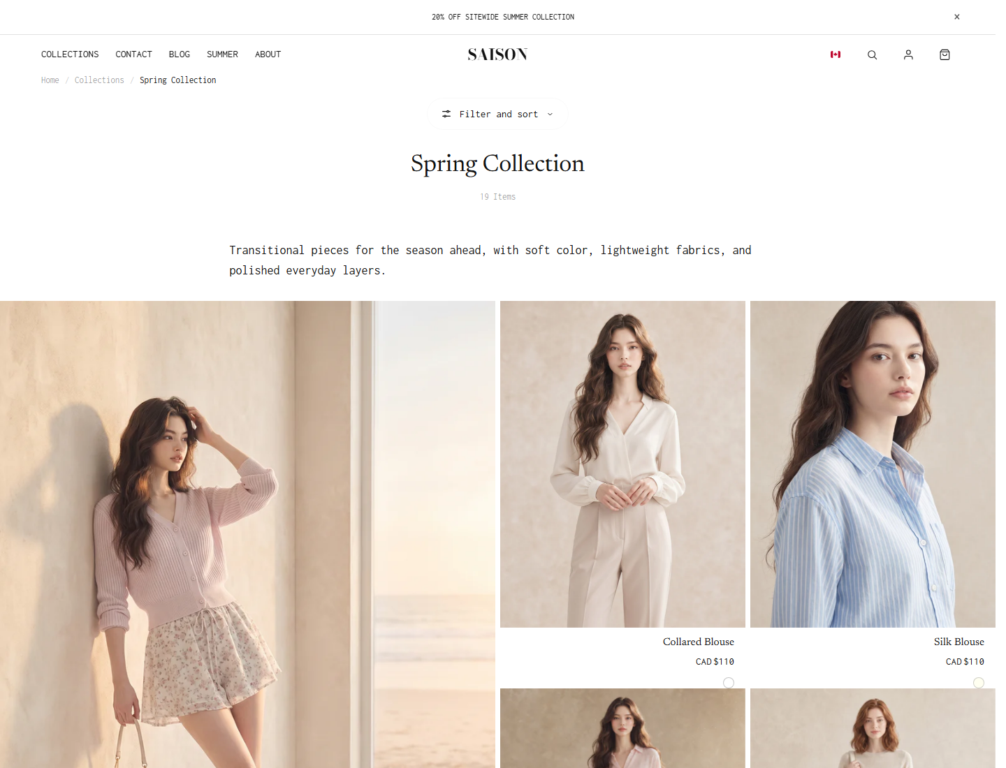
SAISON collection page with product cards and filters
Start from the real collection view before adding editorial tiles.
  • Filters and sorting live above the grid when show_filter_bar and show_sort_by are enabled.
  • Product cards come from the Product grid block and inherit card/gallery/swatch settings.
  • Large product heroes are usually Product placement blocks, not separate products.
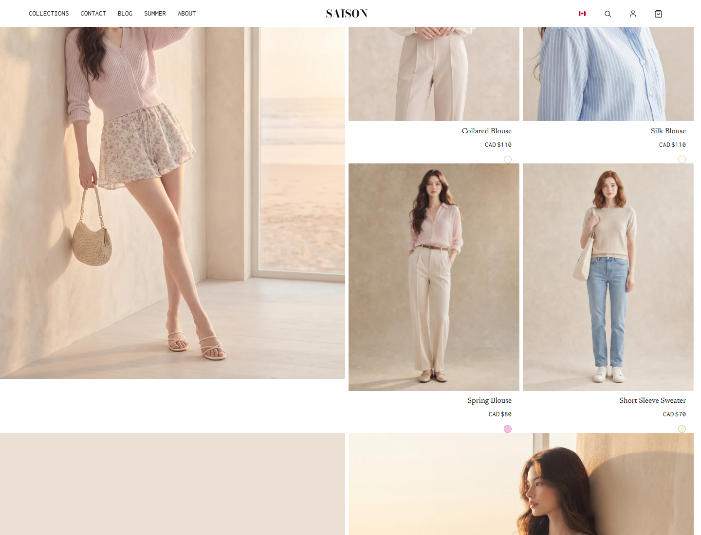
SAISON Image text grid with mixed product and editorial tiles
Use editorial blocks sparingly so shoppers still see enough products near the top.
  • Hero images and look tiles are fixed editorial moments.
  • Repeat rules create recurring product hero spans by row and target column.
  • Mobile behavior should be checked after every large tile is added.

Static Layout Examples

Regular 4-column gridUse Product grid only. Best for catalogs where comparison and filter use matter more than editorial rhythm.
Product 1
Product 2
Product 3
Product 4
Product 5
Product 6
Product 7
Product 8
First product 2x2 heroUse Product placement for index 1. The product stream still fills the next available cells around it.
Product 1 hero
Product 2
Product 3
Product 4
Product 5
Product 6
Product 7
Product 8
Look tile with product streamUse a Look tile for fixed editorial context, then keep regular product cards visible around it.
Look tile
Product 1
Product 2
Product 3
Product 4
Product 5
Product 6
Alternating repeat ruleUse Repeat rule when the same product hero treatment should recur by row. Product placement still wins for exact product indexes.
Product 1
Product 2
Product 3
Product 4
Repeat hero
Product 5
Product 6
Product 7
Product 8
Repeat hero

Build It In Shopify

1

Open the collection template

In the theme editor, open the collection template and select Image text grid.

2

Set the product source

Add or select the Product grid block. Use source = collection for normal collection pages, manual for curated pages, and rule only when tag include/exclude behavior is intentional.

3

Choose the base grid

Set columns, row ratio, mobile row ratio, gaps, edge-to-edge, pagination, filters, sorting, and product card settings before adding editorial blocks.

4

Add one editorial move

Add one Product placement, Look tile, Promo tile, Hero image, Hero composition, Product tile, or Spacer block. Preview desktop and mobile before adding the next one.

5

Use repeat rules only for recurring rhythm

Add Repeat rule blocks when the same treatment should recur by row and column. Use mobile_behavior = fallback_1x1 unless the repeated hero is important enough to stay large on phones.

High-Impact Settings

Theme editor setting

columns_desktop / columns_tablet / columns_mobile

What this controls

How many grid cells appear across each screen size.

When to change it

The grid feels too dense or too sparse.

Watch out

Changing product card settings before deciding grid density.

Theme editor setting

row_ratio / row_height_px

What this controls

The height logic for each grid row, either aspect-ratio based or fixed pixels.

When to change it

Product or editorial crops need a consistent shape.

Watch out

Using custom height before final media is uploaded.

Theme editor setting

gap_px / row_gap_px

What this controls

The horizontal and vertical space between product and editorial tiles.

When to change it

The page needs editorial edge-to-edge rhythm or classic catalog spacing.

Watch out

Large gaps with many 1x1 products, which makes the collection feel slow.

Theme editor setting

show_filter_bar / show_sort_by

What this controls

Collection controls that let customers filter and reorder products.

When to change it

Customers need to narrow large collections.

Watch out

Expecting filters to appear before Shopify Search & Discovery filters are configured.

Theme editor setting

show_grid_overlay

What this controls

A temporary builder overlay that shows grid rows, columns, and product indexes.

When to change it

You need to debug product indexes, rows, or columns.

Watch out

Leaving the overlay visible on a published theme.

Theme editor setting

product_placement.index

What this controls

A product-stream position that receives a larger custom span.

When to change it

A product from the stream should become larger.

Watch out

Forgetting that filtering and sorting can change the visible product index.

Theme editor setting

repeat_rule.pattern_type / tile_type

What this controls

Rules that automatically make product tiles larger at repeating row positions.

When to change it

A product hero treatment should repeat automatically.

Watch out

Repeating too often and hiding too many regular products.

Theme editor setting

mobile_behavior

What this controls

How large desktop feature tiles resize, collapse, or hide on phones.

When to change it

Large desktop tiles make mobile browsing too tall.

Watch out

Using inherit for every large tile without checking phone preview.

Product, Card, And Swatch Settings

SettingLocationRecommendedNotes
source, products, include_tags, exclude_tags, max_itemsProduct grid blocksource = collection and max_items = 24 to 48 for most collection pagesManual products do not follow collection sort order; tag filters must match Shopify product tags exactly.
show_price, show_vendor, show_quick_add, hover_secondary_imageProduct grid blockShow price, show quick add for simple products, hide vendor unless multi-brandQuick add should be tested with variant-heavy and sold-out products.
card_media_source, card_gallery_mode, card_gallery_max_images, card_gallery_nav_styleImage text grid > Cards and Card galleryInherit global behavior unless the collection has a special campaign cropPer-section overrides are useful but can make product cards inconsistent if overused.
swatch_display_mode, swatch_shape, swatch_size_px, swatch_gap_px, swatch_border_opacityImage text grid > Swatchesbelow_card, circle, 16px, 7px gapHover overlay is desktop-focused; below-card swatches are clearer for mobile.
show_collection_image, hide_first_hero_text, collection header colors and sizesImage text grid > Collection headerUse collection image only when it supports the page storyHide first hero text only when the visual hero is self-explanatory.
image_scroll_effectImage text grid > Animationnone or revealUse zoom sparingly on product-heavy grids.
margin_top, margin_bottom, padding_top, padding_bottomImage text grid > SpacingUse defaults firstAdjust after surrounding sections are placed.

Placement Rules Merchants Should Know

  • Product stream fills the first available grid cell from left to right.
  • Product placement by index has the highest priority for product cards.
  • Repeat rules apply by row and target column when the grid cursor reaches that position.
  • Product metafield spans apply only when placement and repeat rules do not override that product.
  • Legacy layout presets are lowest priority.
  • Manual editorial blocks are fixed content tiles and should be checked separately from product stream rules.
  • The Repeat rule max_occurrences setting is exposed in the editor, but storefront behavior is driven by start_row and every_n_rows in the current theme code.

Common mistakes

  • Adding too many large tiles before confirming the regular product grid works.
  • Using manual Product tile blocks when the collection actually needs normal sorting.
  • Forgetting that product indexes change after filtering, sorting, include tags, or exclude tags.
  • Leaving show_grid_overlay on after layout debugging.
  • Using full_width mobile behavior for every repeated hero, making the phone page too long.
  • Expecting color swatches to appear when product option names and swatch setup are inconsistent.