Plan a SAISON homepage with the right section order, real section names, key settings, visual diagrams, and support-reducing setup guidance.
Best first build pageOriginal SAISON sectionsUse 5-7 strong sections
The homepage should explain the brand, show the main product path, and use SAISON's editorial sections selectively. Start with the page goal, then choose the section flow. Do not add every signature section just because it exists.
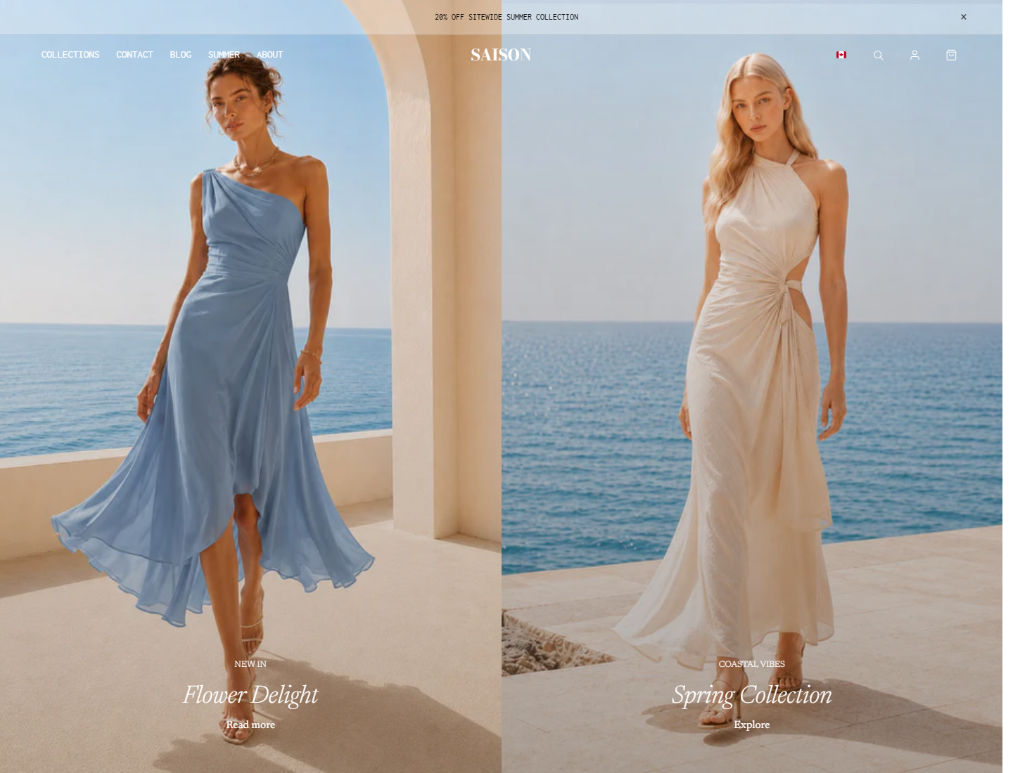
Homepage split hero from the demo store: this first screen works when the store has two strong collection or campaign paths and mobile crops are prepared.
Choose one hero purpose before styling: collection entry, campaign entry, or product launch.
Set mobile crop and mobile layout immediately after desktop media.
Keep the first product or collection path visible before long storytelling sections.
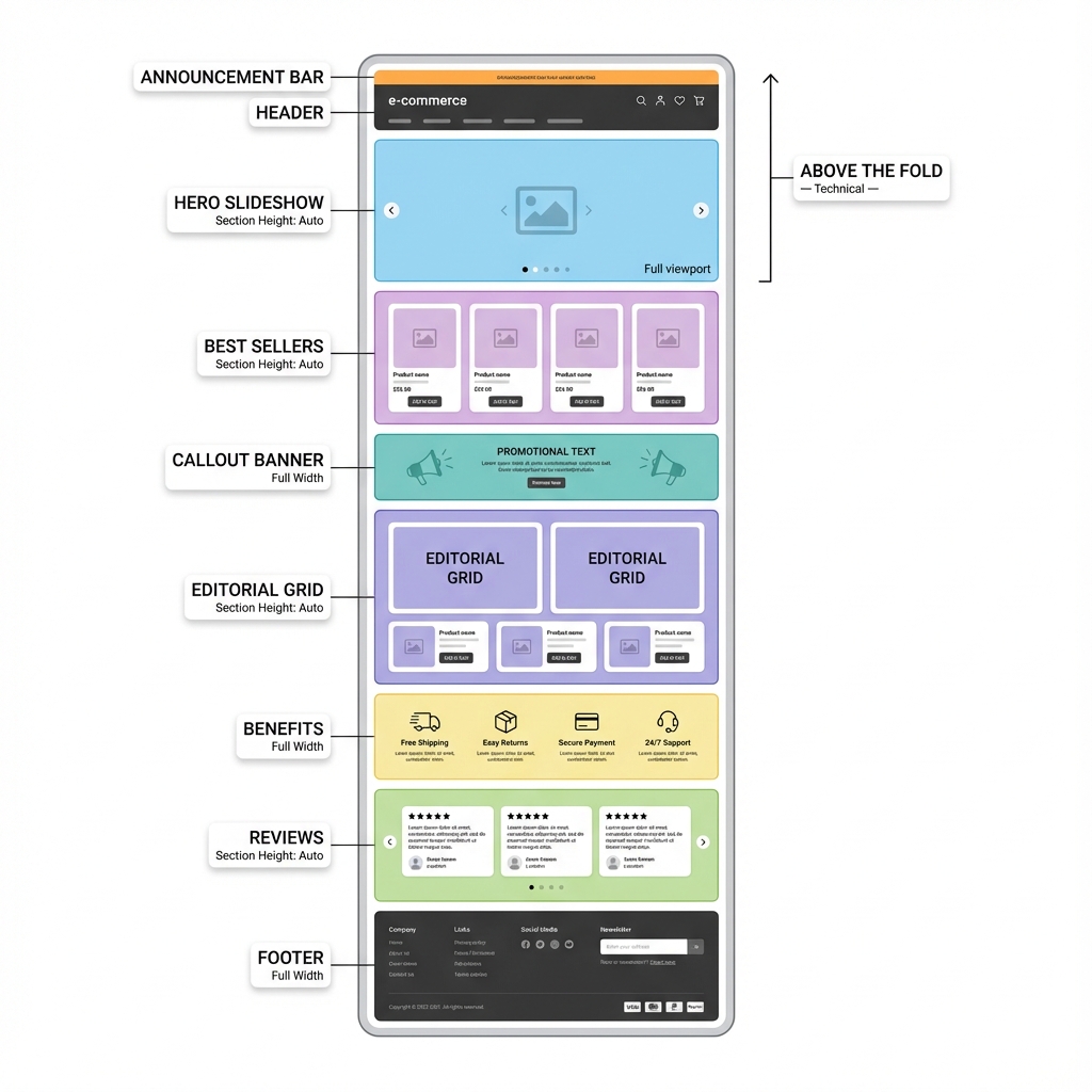
A focused SAISON homepage usually combines one hero, one shopping path, one editorial moment, one proof section, and one final conversion path.
Use 5 to 7 strong sections instead of every available signature section.
Avoid stacking multiple heavy-motion sections back to back.
Proof sections should use real reviews, logos, partners, or press.
How To Plan The Homepage
1
Choose the homepage goal
Pick the store's real goal: editorial brand, product launch, conversion-first shopping, or campaign-heavy storytelling.
2
Start with the balanced flow
Build the shorter version first. Add heavier editorial sections only when you have enough strong images, copy, and mobile crops to support them.
3
Use the decision map before building
Confirm what each section does, where merchants find it in the Shopify editor, and which setting IDs to check first.
4
Preview mobile after the first three sections
The first three sections control the homepage's perceived speed and clarity. Fix mobile crops, text density, and product visibility before adding proof or final shopping paths.
Recommended Homepage Order
✓Start with one hero section that introduces the strongest collection, offer, or campaign.
✓Add one shopping section before the first long editorial section.
✓Use one signature storytelling section to create the SAISON editorial feel.
✓Add proof only when you have real reviews, logos, partners, or press.
✓End with a clear product, collection, newsletter, or campaign path.
High-Priority Settings
Theme editor setting
mobile_layout
What this controls
The phone-specific arrangement of media, text, cards, and buttons.
When to change it
A section has different desktop and mobile composition.
Recommended setup
Choose before styling desktop.
Watch out
Building desktop first and discovering the mobile order does not work.
Theme editor setting
mobile_aspect_ratio / mobile_media_focus
What this controls
The crop shape and focal area used for homepage media on phones.
When to change it
Hero media loses the product, model, face, or campaign subject on phones.
Recommended setup
Set after final media upload.
Watch out
Relying on desktop crops for mobile.
Theme editor setting
desktop_scroll_height
What this controls
How much scroll distance a pinned or sticky homepage section occupies on desktop.
When to change it
Pinned story scroll needs more or less reading time.
Recommended setup
Enough to read, not enough to trap.
Watch out
Long scroll distance with weak story copy.
Theme editor setting
trigger_mode and duration settings
What this controls
When homepage animations start and how long they take.
When to change it
Hero sequential reveal or Card reveal feels too slow.
Recommended setup
Use restrained timing so the product path appears quickly.
Watch out
Letting animation delay shopping.
Theme editor setting
product_card blocks
What this controls
The individual product cards, images, labels, and styling used inside featured product sections.
When to change it
Featured product grid needs a curated shopping edit.
Recommended setup
3 to 6 strong products.
Watch out
Turning a homepage edit into a full catalog.
Theme editor setting
show_progress / show_arrows
What this controls
Controls that tell customers a slideshow or carousel has more content.
When to change it
A slideshow, scroll showcase, or reviews section has multiple items.
Recommended setup
Show controls when customers need to discover more content.
Watch out
Hiding controls and making customers guess there is more content.
Theme editor setting
auto_rotate / pause_on_hover
What this controls
Automatic movement and pause behavior for rotating sections.
When to change it
Logo tabs, tickers, or review sections move automatically.