Product card system
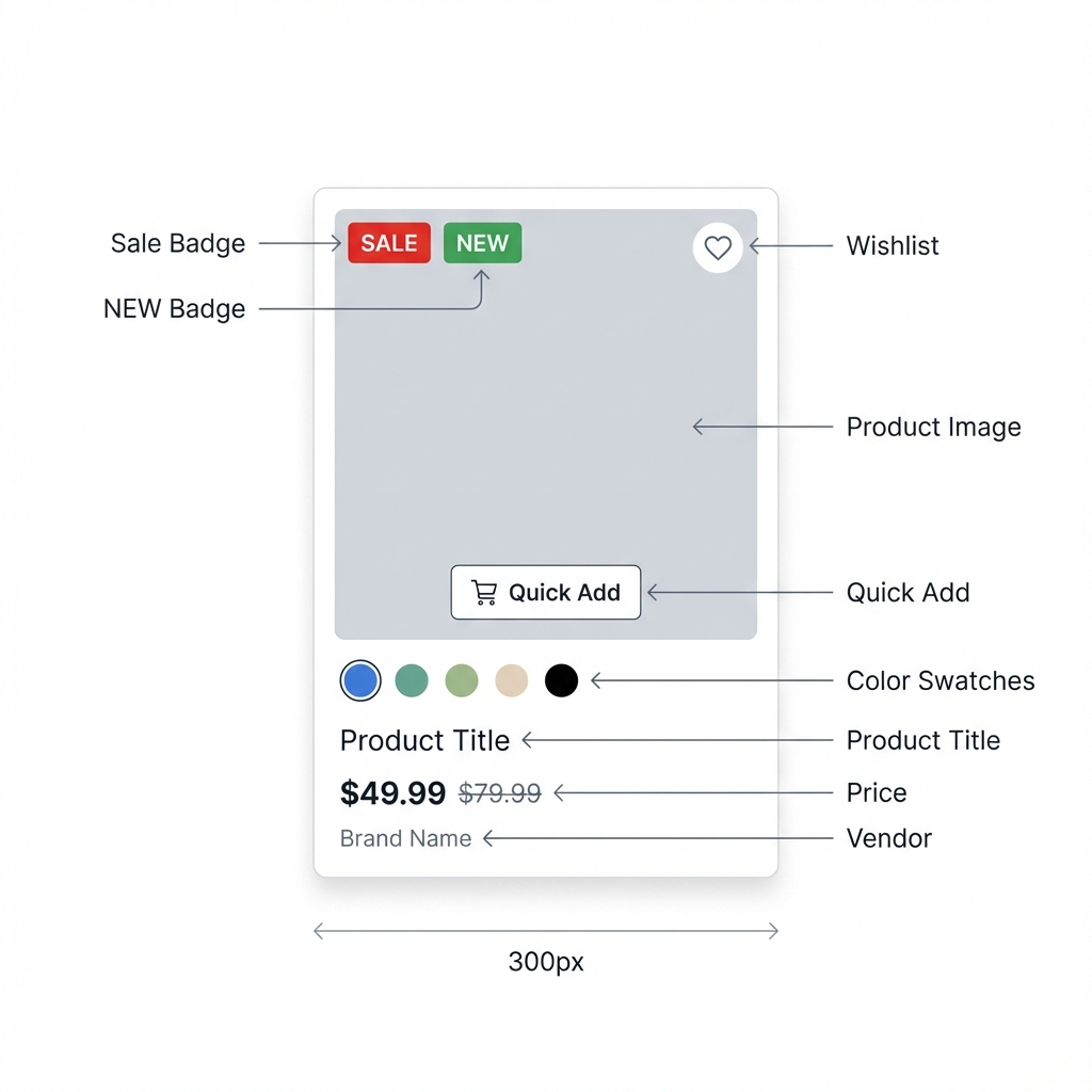
Configure how product cards look and behave across collection grids, homepage product sections, recommendations, and quick add flows.
Product cards are one of the most reused parts of SAISON. Configure them early so collection pages, product recommendations, featured product grids, and quick add behavior feel consistent.
- Confirm product option names are consistent before tuning swatch styling.
- Use card gallery only when product media order is consistent.
- Test product cards in collection grids, homepage grids, search, and recommendations.
What Product Cards Control
- Product image ratio and crop behavior.
- Hover image or gallery behavior.
- Arrows, dots, and mobile gallery controls.
- Sale, sold out, new, and custom badges.
- Price, compare-at price, vendor, and product title display.
- Color swatches and variant previews.
- Quick add buttons and chooser behavior.
Setup Steps
Set global product card behavior
Go to theme settings and configure product card media, badges, swatches, price display, and quick add defaults before editing individual grids.
Confirm product media consistency
Product card polish depends on consistent photography. Use similar crop, background, and image order across products in the same collection.
Choose gallery behavior
Decide whether cards use a single image, hover image, or gallery. Use gallery controls only where customers benefit from inspecting multiple images.
Set badge rules
Enable sale, sold out, new, or custom badges only when they help customers make a decision. Too many badges reduce clarity.
Override per grid only when needed
Collection and feature grids can override product cards. Use overrides for special campaigns, not as the default way to fix product data.
Key Settings
| Setting | Location | Recommended | Notes |
|---|---|---|---|
| Image ratio | Theme settings > Product selling | Use one ratio per catalog style | Mixed ratios make collection grids look uneven. |
| Card gallery | Theme settings > Product selling | Enable for visual products | Limit image count to keep browsing fast. |
| Gallery arrows and dots | Theme settings or grid override | Desktop arrows, restrained dots | Controls should not overpower product imagery. |
| Badges | Theme settings > Product badges | Sale and sold out at minimum | Custom badges work best for launches, new arrivals, and exclusives. |
| Swatches | Theme settings > Product options | Enable for color/material products | Product option names must be consistent. |
| Quick add mode | Theme settings > Product selling | Direct add for simple products, chooser for variants | Variant-heavy products need a selection step. |
| Grid-level overrides | Collection or featured product grid section | Use only for special layouts | Too many overrides make behavior hard to support. |
Where Product Cards Appear
- Collection product grids.
- Image text grid product blocks.
- Featured product grid homepage sections.
- Product recommendations.
- Related and complementary product sections.
- Search results.
- Quick add flows.
Common Mistakes
- Enabling quick add for variant-heavy products without chooser behavior.
- Using card galleries when product media is inconsistent.
- Showing too many badges at once.
- Expecting swatches to work when product option names vary across products.
- Fixing product data problems with section-level overrides.