Mosaic Grid
A highly customizable grid section for campaign imagery, allowing precise control over row and column spans to create bento-box style layouts.
The Mosaic Grid is one of SAISON's most powerful editorial sections. Unlike a standard image gallery, it allows you to define exactly how many columns and rows each image occupies, letting you build complex, asymmetrical layouts (like a bento box).
Grid Math & Layout Logic
To build a successful mosaic grid, you must understand how the block spanning settings interact with the section's column settings.
Set the Master Grid (Section Settings)
In the section settings, find Desktop layout > Number of columns. This defines the underlying grid (e.g., 3 columns). You also set a Row height (e.g., 300px), which acts as the base unit for vertical sizing.
Span Columns (Block Settings)
Click on an individual image block. The Column span (desktop) setting dictates how many of the master columns this image takes up. If your master grid is 3 columns, and you set a block to span 2 columns, it will take up 2/3 of the width.
Span Rows (Block Settings)
The Row span (desktop) setting dictates how many base row heights the image occupies vertically. If your row height is 300px and you set a row span of 2, the image will be 600px tall (plus gaps).
Grid Overflows: If you tell an image to span more columns than exist in the master grid (e.g., spanning 4 columns in a 3-column grid), the layout will break or wrap unpredictably. Always ensure your spans fit within the master grid!
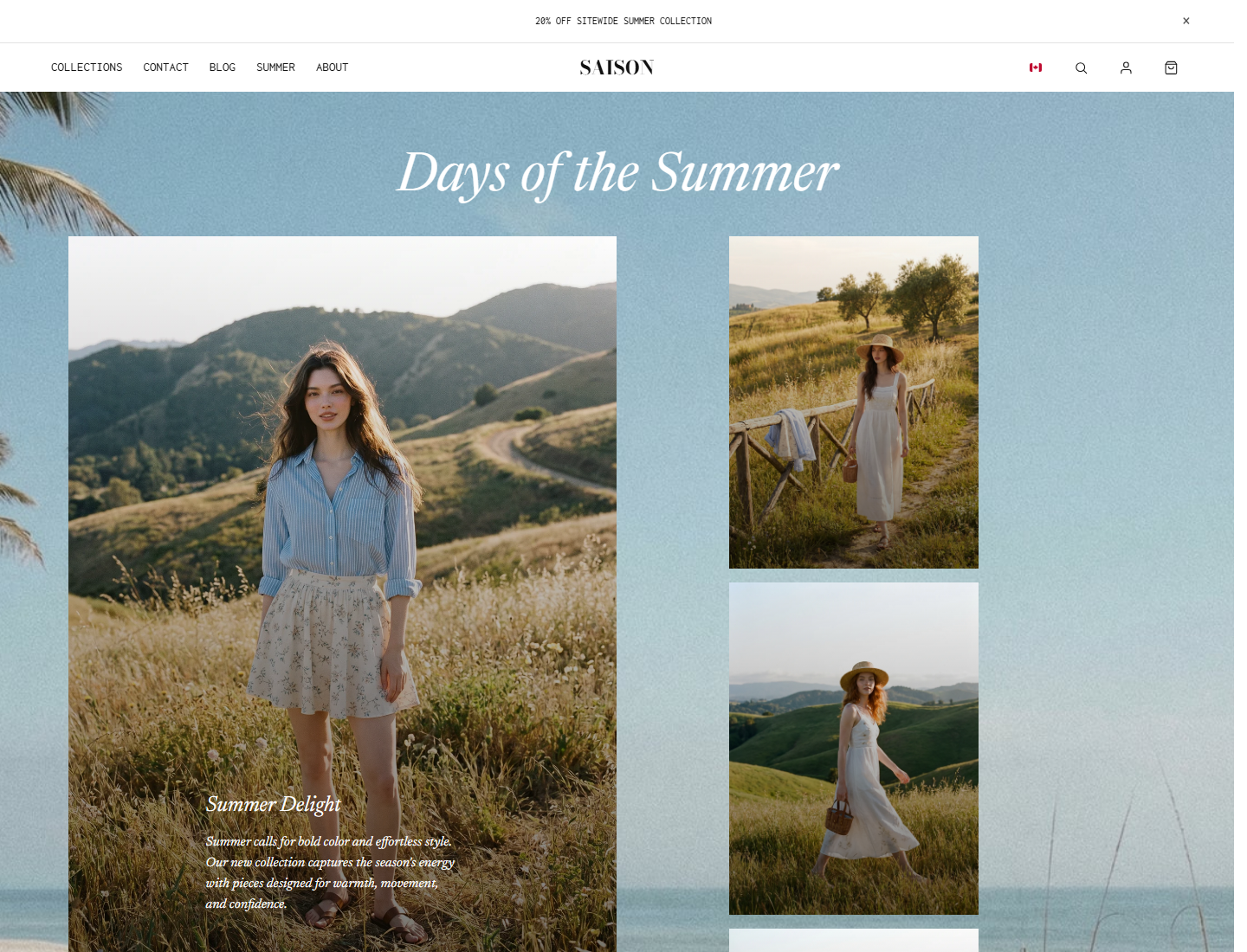
Mobile Layouts
Mobile requires a completely different approach because screens are narrow. SAISON handles this by providing separate mobile grid settings.
- Set the Mobile layout type in the section settings (e.g., 'Overlap Triptych' or standard grid).
- Adjust the Mobile columns (usually 1 or 2).
- Use the Mobile column span and Mobile row span settings on each image block to redefine the layout for small screens.
Key Settings Reference
| Setting | Location | Recommended | Notes |
|---|---|---|---|
| Layout Type | Section | Asymmetrical | Pre-configures a starting grid, but manual spanning overrides it. |
| Row height desktop | Section | 250-400px | The base vertical unit. Smaller numbers give more granular control. |
| Image fit | Block | Cover | Ensures the image fills the spanned area without distorting. |
| Text layout | Block | Overlay | Text sits on top of the image (requires setting overlay opacity). |
Common mistakes
- Adding text to a bright image without overlay opacity, making the copy unreadable.
- Forgetting mobile spans; a desktop 3-column span can become a narrow mobile sliver.
- Setting an image to span more columns than the master grid contains.
- Using natural image fit when the section needs a controlled grid composition.