Product
Complete merchant reference for SAISON's Product section: Runway, 50/50, 60/40, media behavior, variant swatches, size guide, sticky buying controls, and product information blocks.
Use this page when you need to find where a product-page setting lives or what it changes. For the decision guide with screenshots, start with Product page views. For exact schema search across the full theme, use the All Settings Reference.
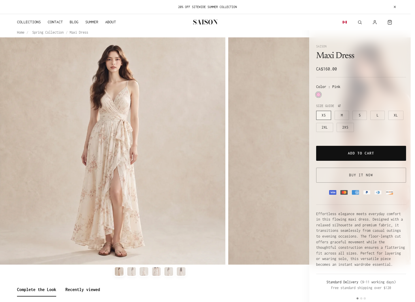
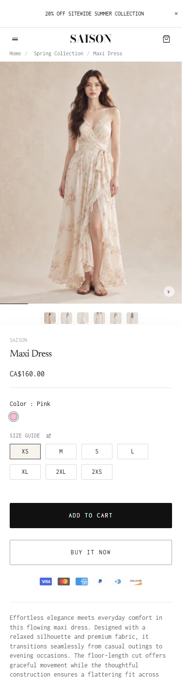
Product Views
| Setting | Location | Recommended | Notes |
|---|---|---|---|
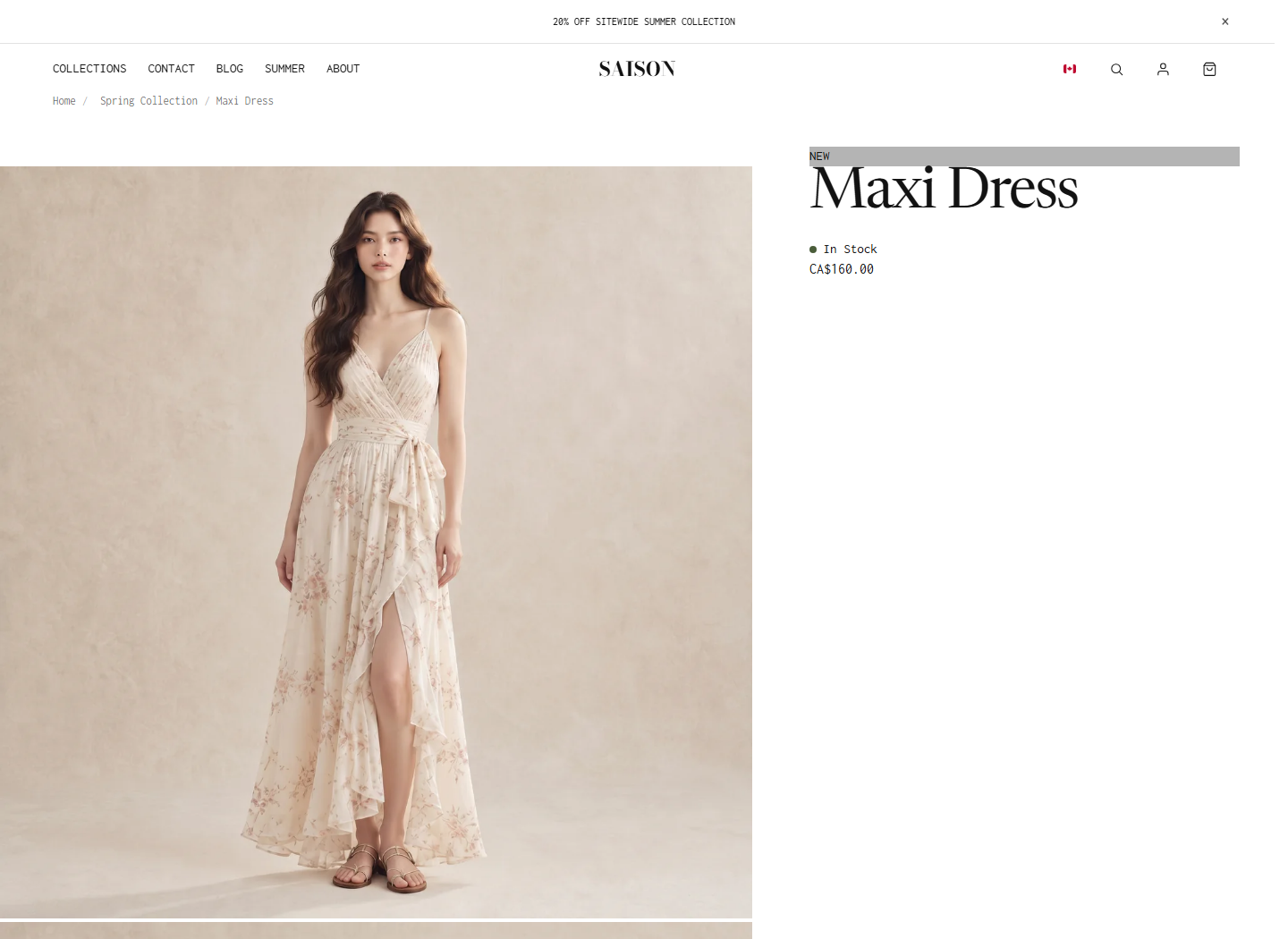
| layout_style = stack | Product section > Layout | Runway for visual launches | Adds the Runway layout with horizontal media and a sticky/floating product information rail. |
| layout_style = 50-50 | Product section > Layout | Safe default for general products | Balances product media and product information. |
| layout_style = 60-40 | Product section > Layout | Image-led split pages | Gives more room to media while keeping a standard purchase column. |
| product.json | Theme templates | Default Runway-oriented product page | Includes Product, recommendations, benefits, reveal video, and text block sections. |
| product.60-40.json | Theme templates | Alternative image-led split template | Starts with layout_style = 60-40 and slider_animation = scroll. |
Layout And Runway Settings
| Setting | Location | Recommended | Notes |
|---|---|---|---|
| layout_style | Product section > Layout | Choose first | Options: stack, 50-50, 60-40. |
| runway_rail_end | Product section > Runway | marked_section for long product pages | Runway only. Options: footer, next_section, marked_section. |
| info_style | Product section > Product info | standard | Options: standard, minimal, premium. |
| container_width | Product section > Layout | narrow for Runway, inherit for most pages | Options: inherit, narrow, wide. |
| runway_right_gap | Product section > Runway | 0 | Space between the Runway info rail and viewport edge. |
| runway_rail_width_px | Product section > Runway | 360 | Width of the Runway purchase rail. |
| followup_shell_min_width_vw | Product section > Runway | 95 | Minimum shell width after the Runway media sequence. |
| runway_media_max_px | Product section > Runway | 850 | Maximum width of each Runway media item. |
| runway_media_min_px | Product section > Runway | 320 | Minimum width of each Runway media item. |
| runway_media_vw | Product section > Runway | 60 | Preferred Runway media width as a viewport percentage. |
| margin_top / margin_bottom | Product section > Spacing | 0 unless page rhythm needs adjustment | Outer section spacing. |
| padding_top / padding_bottom | Product section > Spacing | 0 unless page rhythm needs adjustment | Inner section spacing. |
Media And Gallery Settings
| Setting | Location | Recommended | Notes |
|---|---|---|---|
| media_layout | Product section > Media | stacked | Options: stacked, stacked_2_columns, stacked_2_columns_big. Hidden when layout_style = stack. |
| flush_media_top | Product section > Media | On for Runway | Lets product media sit closer to the viewport/header. |
| media_height | Product section > Media | full | Options: full, square, fit_screen. |
| mobile_square_image_treatment | Product section > Mobile media | auto | Options: auto, portrait_crop, natural. |
| slider_animation | Product section > Gallery | swipe or scroll | Options: fade, scroll, swipe. |
| dots_position | Product section > Gallery | below_global or overlay | Options: overlay, below_mobile, below_global. |
| mobile_pagination_style | Product section > Gallery | full_bleed | Options: full_bleed, short. |
| thumbnails_position | Product section > Gallery | bottom | Options: left, bottom. |
| show_thumbnails | Product section > Gallery | On | Shows thumbnail navigation. |
| show_arrows_mobile | Product section > Gallery | Leave off for current stacked/swipe layouts | Current Liquid only renders these arrows for carousel media layout. |
| enable_zoom | Product section > Gallery | On | Allows product media zoom where supported. |
| smooth_scroll_stacked | Product section > Gallery | On | Smooths stacked media scrolling. |
Variant Media And Swatches
| Setting | Location | Recommended | Notes |
|---|---|---|---|
| enable_color_hover_preview | Product section > Variant media | On | Allows color hover/focus to preview matching product media. |
| revert_delay_ms | Product section > Variant media | 0 | How long to wait before reverting a hover preview. |
| canonical_size | Product section > Variant media | S for apparel when media differs by size | Preferred size used when selecting color gallery media. |
| color_fallback_behavior | Product section > Variant media | product_media | Options: product_media, no_swap. |
| variant_picker | Options block | buttons | Options: buttons, dropdown. |
| color_swatch_type | Options block | small_square | Options: small_square, big_square, square_with_label. |
| enable_color_swatch_preview | Options block | On | Shows a larger color preview on hover or focus. |
| enable_color_swatch_max_height | Options block | On for products with many colors | Limits swatch row height and adds scrolling. |
Product Info Appearance
| Setting | Location | Recommended | Notes |
|---|---|---|---|
| product_info_bg | Product section > Product info | solid for most pages, glass for Runway | Options: solid, glass. |
| glass_opacity | Product section > Product info | 0.2 to 0.6 | Only affects glass product info background. |
| product_title_size_desktop | Product section > Typography | 30 to 64 depending on layout | Default schema value is 64; current default template uses 30. |
| product_title_size_mobile | Product section > Typography | 20 to 40 | Default schema value is 40; current default template uses 20. |
| info_block_gap | Product section > Product info spacing | 24 | Vertical gap between product information blocks. |
| info_panel_padding_vertical / horizontal | Product section > Product info spacing | 34 / 40 | Padding inside the product information panel. |
| variant_group_spacing | Product section > Product info spacing | 24 | Spacing between variant groups. |
| accordion_row_spacing | Product section > Product info spacing | 18 | Spacing between accordion rows. |
| button_group_spacing | Product section > Product info spacing | 12 | Spacing around purchase buttons. |
| swatch_size | Product section > Product info sizing | 22 | Size used for product-page swatches. |
| size_button_height / size_button_min_width | Product section > Product info sizing | 32 / 50 | Controls size option button dimensions. |
| price_text_size / body_text_size / button_height | Product section > Product info sizing | 16 / 14 / 52 | Controls price, body, and action button scale. |
Buying, Status, And Size Guide
| Setting | Location | Recommended | Notes |
|---|---|---|---|
| show_new_badge | Product section > Status | On when newness matters | Displays NEW badge for recent products. |
| new_badge_days | Product section > Status | 28 | Products created within this many days can show the NEW badge. |
| show_stock_status | Product section > Status | On | Enables stock status display when the related block is present. |
| show_points_program / points_text | Product section > Status | On only if loyalty messaging is real | Displays loyalty points text. |
| show_taxes_included_message | Product section > Buying | On where required | Shows taxes-included message. |
| show_pricing_notice | Product section > Buying | Use for special terms | Works with pricing_notice_text, pricing_notice_link, pricing_notice_link_label. |
| show_pay_installments | Product section > Buying | On | Shows supported payment installment terms. |
| enable_sticky_atc | Product section > Buying | On for long pages | Keeps purchase action reachable as customers scroll. |
| show_inline_qty | Product section > Buying | On when customers often buy multiples | Adds inline quantity controls near buying actions. |
| hide_variants | Product section > Buying | Off unless unavailable options cause confusion | Hides unavailable variants when enabled. |
| show_size_guide | Product section > Size guide | On for size-sensitive products | Requires connected size guide content. |
| size_guide_button_placement | Product section > Size guide | under_options | Options: under_options, drawer. |
| size_guide_button_label / icon / drawer heading / tab labels | Product section > Size guide | Keep labels concise | Controls size guide button and drawer text. |
UI Color Settings
| Setting | Location | Recommended | Notes |
|---|---|---|---|
| ui_style | Product section > UI | dark for light product media | Options: light, dark. |
| ui_button_color | Product section > UI colors | Leave blank to inherit unless contrast needs fixing | Custom UI button text/icon color. |
| ui_button_bg | Product section > UI colors | Leave blank to inherit | Custom UI button background. |
| ui_button_border | Product section > UI colors | Leave blank to inherit | Custom UI button border. |
Core Blocks
| Setting | Location | Recommended | Notes |
|---|---|---|---|
| vendor.vendor_link | Vendor block | On | Links vendor text when useful for multi-brand stores. |
| sku.sku_text | SKU block | SKU: {SKU} | Use {SKU} placeholder for the selected variant SKU. |
| title | Title block | Place near the top | Displays product title. |
| text.text | Intro text block | Optional | Rich text above or near the buying stack. |
| description.display_style | Description block | plain for short copy, accordion for long copy | Options: plain, accordion. |
| description.accordion_label | Description block | Description | Accordion heading when display_style is accordion. |
| price | Price block | Place before options | Displays price, compare-at price, and unit price where applicable. |
| quantity | Quantity block | Place before add to cart | Displays quantity selector. |
| add_to_cart.show_additional_payment_buttons | Add to cart block | On | Shows dynamic checkout buttons and payment icons/terms when available. |
Trust And Content Blocks
| Setting | Location | Recommended | Notes |
|---|---|---|---|
| benefits icon, heading, link label, link URL | Benefits block | Use 1 to 3 benefit items | Supports three icon/heading/link groups. |
| badges | Badges block | Use when badges are meaningful | Displays product badges handled by the section. |
| inventory_status low/high stock text, icons, threshold, colors | Inventory status block | Use for scarcity and availability clarity | Threshold controls when low stock messaging appears. |
| collapsible_info toggles and richtext fields | Collapsible info block | Use for size, material, delivery, returns, and model info | Keeps long support content scannable. |
| shipping_info thresholds, easy returns, padding, slide spacing | Shipping info block | Use when shipping/returns reduce hesitation | Supports free standard and express threshold text. |
| sales_point icon and text | Sales point block | Use for one concise trust message | Good for warranty, guarantee, or limited offer text. |
| discount heading, text, code | Discount block | Use for visible promotion codes | Do not show stale discount codes. |
Advanced And Support Blocks
| Setting | Location | Recommended | Notes |
|---|---|---|---|
| option_accuracy heading, active_state, point_1 through point_6 | Option accuracy block | Use for fit or sizing confidence | Shows a visual confidence/accuracy meter. |
| progress_range show_1 through show_4, label, value | Progress range block | Use for product attributes that benefit from scales | Examples: warmth, compression, coverage, firmness. |
| product_combination.option_name | Product combination block | Use for grouped option combinations | Default option name is Color. |
| custom_field field_label / required_text | Product note field block | Use when customers need to enter a note | Examples: personalization, gift message, initials. |
| socials show_facebook / show_twitter / show_pinterest | Socials block | Use only if sharing matters for the category | Shows selected social share options. |
| notify_me labels and heading | Notify me block | Use for sold-out products | Only renders for unavailable variants. |
| ask_question labels and heading | Ask a question block | Use for high-consideration products | Collects name, email, phone, and message fields. |
| pickup_availability | Pickup availability block | Use when local pickup is configured | Displays store pickup information from variant availability. |
| complementary_products.heading | Complementary products block | Complete the look | Shows complementary product recommendations. |
| custom_liquid.custom_liquid | Custom Liquid block | Use only for trusted snippets | Advanced custom output inside the product information stack. |
| @app | App block | Use for reviews, subscriptions, personalization, or other app content | Test app blocks after theme or app updates. |
Troubleshooting
Cannot find Runway
In the Product section, choose layout_style = stack. The setting uses stack; the docs call this view Runway because that is the visual behavior.
The 60/40 template does not include all default product blocks
The product.60-40.json template starts with only the Product section settings. Add or copy the needed Product section blocks if you want the same purchase stack as the default product template.
Swatches show the wrong color or image
Check Shopify variant swatches first, then custom variant metafield custom.swatch, variant featured images, and color gallery metafields. After data is correct, review the Options block swatch settings.
Size guide does not render
Turn on show_size_guide, verify the product has connected size guide content, and confirm the relevant option name includes a size-like option where the under-options button should appear.
Product page feels crowded
Reduce optional blocks before changing layout. Keep title, price, options, quantity, add to cart, and the most important support information near the top; move extra education into accordions or below-product sections.